A 4 – Colour Coalition
Title
Colour Coalition
Task
Design ONE postcard (both front and back) to promote, or create awareness of a travel theme. The theme can be international, regional or local.=
Initial Ideas
Since the theme is on traveling, and we are discouraged to design postcards that are “touristy” and typical, I’ve decided to base my design on the process of physical traveling itself.
My inspiration comes from one of my recent experiences, that is, taking a train from Singapore to Johor, Malaysia with my family. Since it was my first experience traveling to Malaysia by train (instead of driving or taking a bus to Malaysia like more Singaporeans do), I really enjoyed the train ride itself. Thus, I wanted to have the “train” element included in my design. While doing up rough sketches of the postcard, I was thinking about what can I draw to represent a train? At this point, I thought of how an airplane can be clearly represented by its distinctive small rounded window, and wished i could do the same for the train.
“Why not include the plane window into the design as well?” I thought. And I could add in another mode of transport that represents air, land, and sea travel!
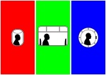
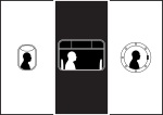
So, this brings me to my final design for my postcard:In addition, here are my colour exploration for my postcard.
Colour is important since my design makes use of simple panels to separate the 3 different modes of transport.
Colour Schemes
The colour scheme used are:
• Warm colours: Red, Orange, Yellow
• Cool colours: Purple, Blue, Green
• Speaking colours: Blue, Magenta, Green
• RGB: Red, Green, Blue
• CMYK: Cyan, Magenta, Yellow
• Grey-Magenta-Grey
• Black and White
• Full Grey


Final Prototype
Front:

Back:

